top of page

Mr.BigBali
Challenge.
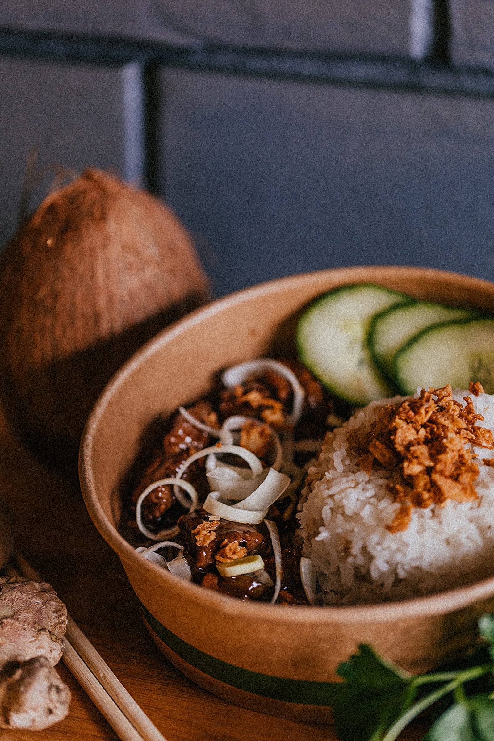
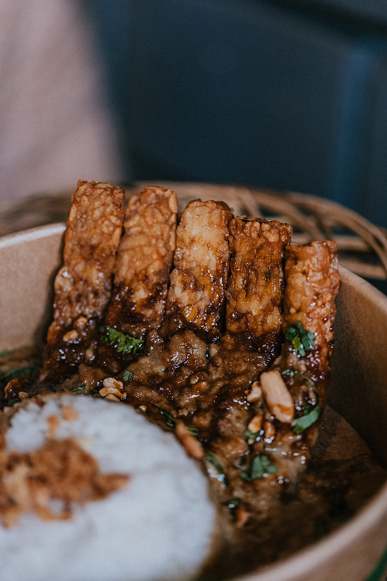
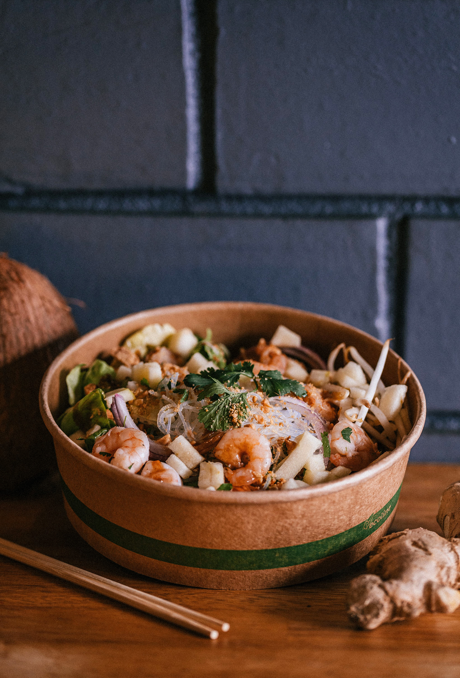
Founded by Arthur, originally from Indonesia, Mr.BigBali offers generous and flavorful street food inspired by authentic Balinese recipes. Rooted in heritage and tradition, the cuisine blends authenticity with pure culinary pleasure. The challenge was to create a strong and memorable visual identity that reflects this Balinese soul while remaining approachable, friendly, and accessible—capturing both the warmth of street food culture and the uniqueness of its origins.
Process.
Drawing inspiration from the Barong, Bali’s iconic protective figure, and reinterpreting it with a “yummy” twist. The traditionally imposing face was softened and modernized: rounded cheeks to evoke indulgence, and a playful tongue licking its lips to convey the instinctive pleasure of tasting.
Impact.
A striking logo that fuses cultural heritage with modern graphic design, becoming the brand’s signature symbol. A true visual invitation to enjoy generous, authentic, and characterful street food.
Client.
Mr.BigBali




#01282C
Pantone 546C
CMJN 86, 12, 0, 81

Let’s talk about logo evolution
The Mr.BigBali logo takes inspiration from the powerful image of a traditional Balinese Barong. Over time, it evolves from a raw, imposing face to a joyful, mouth-watering expression. Rounded cheeks and a tongue licking the lips convey pleasure and conviviality, reflecting both the brand’s festive spirit and its attentiveness to the audience’s experience.

bottom of page
