top of page


Foxi Cycles
Naming.
The name Foxi quickly emerged as the obvious choice: short, fluid, and international, it naturally fits into the everyday vocabulary of Londoners. Inspired by the urban fox, a clever and nocturnal animal roaming the city streets, Foxi embodies the idea of smart, savvy, and accessible mobility. Its direct and memorable nature turns the word into an instinctive expression: “I’ll grab a Foxi.”
Process.
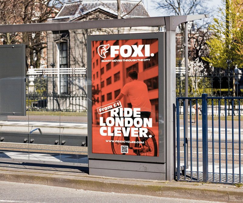
Foxi’s visual identity is based on the iconic silhouette of the London fox. The logo, in flat design, stylizes the animal in a clean and modern way while highlighting its characteristic tail, suggesting movement and agility. This dynamic shape becomes a strong, instantly recognizable symbol. The warm color palette, dominated by energetic orange, conveys vitality, accessibility, and urban visibility. The chosen typography is a bold sans serif, designed for visual impact and immediate readability, even from a distance, notably on the bike frames and across all communication materials.
Impact.
Foxi positions itself as an innovative and desirable brand in London mobility. The strong identity allows the brand to be immediately recognizable, appealing to both residents and visitors, and embodies a practical, safe, and premium service, while creating a playful and engaging universe for its users.
Client.
Foxi Cycles


bottom of page