Blank Street.
Design thinking
Art direction
OOH Compaign
Blank Street.
Design thinking
Art direction
OOH Compaign
Blank Street.
Design thinking
Art direction
OOH Compaign
Context.
Blank Street Coffee works in a strong urban visual system that is simple, fast, and product-focused.
This project explores a Spring campaign for three new flavours.
The goal is to add more visual expression while keeping the existing brand system clear and recognisable.
The aim is not to change the art direction, but to test how the system can feel more expressive in OOH spaces.
Context.
Blank Street Coffee works in a strong urban visual system that is simple, fast, and product-focused.
This project explores a Spring campaign for three new flavours.
The goal is to add more visual expression while keeping the existing brand system clear and recognisable.
The aim is not to change the art direction, but to test how the system can feel more expressive in OOH spaces.
Approach.
The idea is based on a simple tension:
how to make the campaign more sensory while keeping the brand easy to read in a city context.
Instead of showing the products directly, I worked with visual textures from the drinks.
The three flavours are turned into liquid textures, created and adjusted with AI, to focus on feeling instead of literal product images.
The system is based on three rules:
-
abstraction instead of direct representation
-
sensory expression instead of product description
-
controlled variation to stay inside the brand world
Approach.
The idea is based on a simple tension:
how to make the campaign more sensory while keeping the brand easy to read in a city context.
Instead of showing the products directly, I worked with visual textures from the drinks.
The three flavours are turned into liquid textures, created and adjusted with AI, to focus on feeling instead of literal product images.
The system is based on three rules:
-
abstraction instead of direct representation
-
sensory expression instead of product description
-
controlled variation to stay inside the brand world

Cherry glaze
Cold brew
Lemon loaf
Matcha Green

Visual systems.
The visual system is built around liquid textures that represent the three flavours.
These textures are the main visual element of the campaign and are used across all OOH formats.
Typography is a secondary but important layer:
-
rounded headlines to feel more “yummy”
-
glossy 3D text to add more energy and visual impact
The system works in two layers:
-
organic layer (liquid textures)
-
graphic layer (type and brand structure)
This keeps the brand clear while adding more expression.
Visual systems.
The visual system is built around liquid textures that represent the three flavours.
These textures are the main visual element of the campaign and are used across all OOH formats.
Typography is a secondary but important layer:
-
rounded headlines to feel more “yummy”
-
glossy 3D text to add more energy and visual impact
The system works in two layers:
-
organic layer (liquid textures)
-
graphic layer (type and brand structure)
This keeps the brand clear while adding more expression.


System in use.
System in use.


Application.
The system is applied to OOH mockups designed for a fast urban environment, where attention is very short.
The layouts are made to be understood in a few seconds, even in busy city spaces.
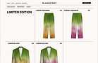
The project is also extended to a limited clothing series (blazer and pants), using the same visual textures.
These pieces turn the liquid gradients into soft tie-dye patterns, creating a link between campaign and product.
The whole project becomes an extended brand system between public space and physical objects.
Application.
The system is applied to OOH mockups designed for a fast urban environment, where attention is very short.
The layouts are made to be understood in a few seconds, even in busy city spaces.
The project is also extended to a limited clothing series (blazer and pants), using the same visual textures.
These pieces turn the liquid gradients into soft tie-dye patterns, creating a link between campaign and product.
The whole project becomes an extended brand system between public space and physical objects.


Impact.
The moment a brand becomes desirable enough to be worn, it changes scale.
Merchandising allows Blank Street to move beyond the coffee shop and into the everyday lives of its community. Customers become ambassadors, products become symbols of belonging, and each interaction strengthens the connection to the brand.
What starts as a seasonal campaign can then become something far more lasting: a shared culture.
Impact.
The moment a brand becomes desirable enough to be worn, it changes scale.
Merchandising allows Blank Street to move beyond the coffee shop and into the everyday lives of its community. Customers become ambassadors, products become symbols of belonging, and each interaction strengthens the connection to the brand.
What starts as a seasonal campaign can then become something far more lasting: a shared culture.