Blank Street
Mission.
Art Direction, Brand Campaign & OOH.
Blank Street built its reputation on something most coffee shops overlook: the aesthetics of what's actually in the cup. Not just the taste — the colour, the texture, the way ingredients come together.
For their Spring 2026 campaign, the goal was to put exactly that front and centre. No packaging, no lifestyle dressing. The product itself, close enough to feel almost abstract. And powerful enough to need nothing else.

Process.
From that raw material, three posters built like paintings. The hero fruit's name set in glossy 3D type, almost edible. The recipe's texture filling the frame. A composition designed to land at a glance, with no effort, no explanation needed. Tight, dense, uncompromising.


Impact.
The campaign doesn't stop at the poster. The visual territory extends into a shoot with oversized fruit props, grounding each flavour in its own sensory world. And to follow the concept through to its logical end, a limited merch drop: one blazer and one trouser per colourway, treated with a heavy blur effect for a high-end fashion finish. Pieces to collect as much as to wear — the must-have of the season for anyone who calls themselves a Blank Street regular.
By repositioning Blank Street as a brand of desire, the campaign broadens its audience while deepening loyalty among existing customers. The limited merch introduces a direct revenue stream while strengthening brand attachment. A OOH deployment of this scale requires serious investment — but the return is proportional: mass visibility across London's highest-footfall locations, an immediate spike in desirability, organic conversion into orders. A brand you see everywhere becomes a brand people talk about. And a brand people talk about, they keep coming back to.


Naming.
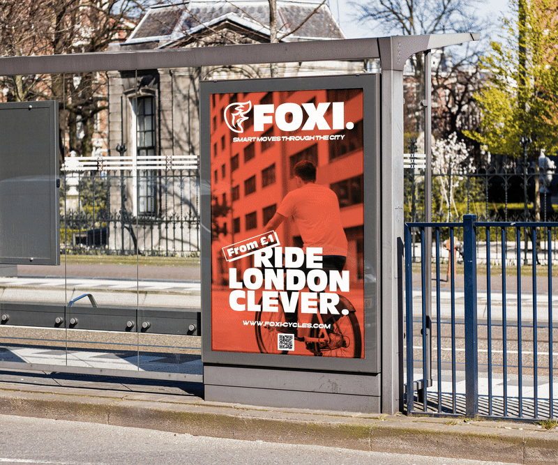
The name Foxi quickly emerged as the obvious choice: short, fluid, and international, it naturally fits into the everyday vocabulary of Londoners. Inspired by the urban fox, a clever and nocturnal animal roaming the city streets, Foxi embodies the idea of smart, savvy, and accessible mobility. Its direct and memorable nature turns the word into an instinctive expression: “I’ll grab a Foxi.”
Process.
Foxi’s visual identity is based on the iconic silhouette of the London fox. The logo, in flat design, stylizes the animal in a clean and modern way while highlighting its characteristic tail, suggesting movement and agility. This dynamic shape becomes a strong, instantly recognizable symbol. The warm color palette, dominated by energetic orange, conveys vitality, accessibility, and urban visibility. The chosen typography is a bold sans serif, designed for visual impact and immediate readability, even from a distance, notably on the bike frames and across all communication materials.
Impact.
Foxi positions itself as an innovative and desirable brand in London mobility. The strong identity allows the brand to be immediately recognizable, appealing to both residents and visitors, and embodies a practical, safe, and premium service, while creating a playful and engaging universe for its users.
Client.
Foxi Cycles